First impressions are established in seconds, often dictated by subtle design choices that signal either amateurism or authority. High-growth business owners require a visual language that communicates competence and consistency across every digital and physical touchpoint. This resource isolates 13 specific design levers that calibrate a brand's perception. By focusing on foundational elements like typography, color relationships, and layout architecture, you can move away from aesthetic guesswork and toward a cohesive system that supports long-term business objectives.
What's inside
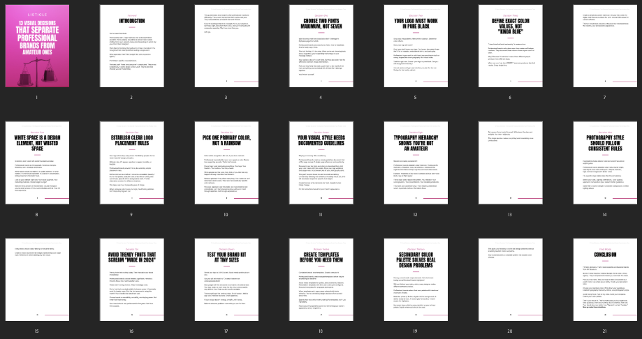
- 13 specific visual decisions to improve brand perception
- Comparative examples illustrating the difference between amateur and professional design
- Standardized rules for fonts, colors, logos, and layout composition
- Application frameworks for websites, social media, and print materials
- Practical execution steps for building a consistent brand kit
Designed for founders and entrepreneurs who need to sharpen their visual identity, this guide provides the technical and aesthetic guardrails necessary to build a professional brand image from the ground up.